Optimize conversion rate: Targeted increase with design
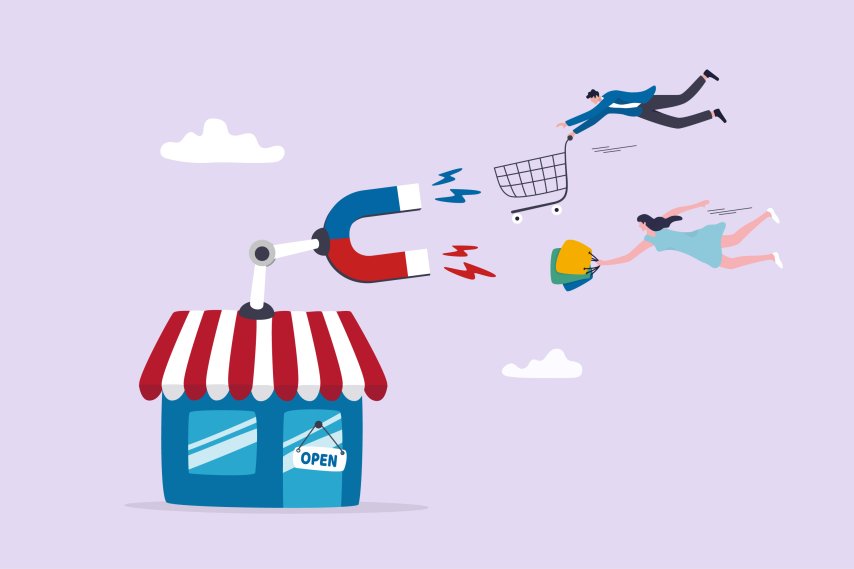
You've probably heard of conversion rate optimization if you've ever wondered how you can increase the sales of your online store. The conversion rate is the value that results when you compare the page views or traffic on your online store with the number of sales. The aim of conversion rate optimization, or CRO for short, is to increase this value. This means that you achieve more sales with the same amount of traffic. That sounds pretty good, doesn't it? So you don't have to make sure that even more visitors come to your online store, but rather get the existing visitors to complete an order. And you can use UX and usability design for this!
Reading time 6 min
- Usability vs. user experience
- The design process of successful UX and usability
- Usability and UX best practices
- A clear structure of the online shop
- Simple and instinctive navigation
- Help your customers to find their way around better
- A promising search function
- Eye-catching CTA buttons
- Optimization of the shopping cart
- Fast loading times
- The choice of colors
- Different fonts
- Further advantages of an optimized UX and usability design
- Conclusion
Usability vs. user experience
Before we give you a few examples of how you can use UX and usability design to optimize your conversion rate in the online store, we would like to briefly explain and compare the two terms. The terms are very close to each other, but mean something different.
Usability refers to the general ease of use or user-friendliness of a website while your customer is on it. The main decisive factor is how well your target group can find their way around the site and how easy it is for them to use the website. Usability is measured by its effectiveness, clarity and success, among other things.
In contrast to usability, UX (user experience) describes the user experience before, during and after visiting a website. It is about the emotions that your online store triggers in your customers. An excellent user experience makes the user like your product. We would now like to give you some tips on how you can use usability and user experience to increase your conversion rate and thus generate more sales of your products.
The design process for successful UX and usability
 To ensure that your ideas for improved usability and user experience actually improve the conversion rate, you should focus on the users, i.e. your customers, in every part of the design process. Try to put yourself in this position in order to decide on different design elements. If you still find it difficult to make such decisions, you can start by looking at other online stores. What do you notice there as a customer? What do you like and what don't you like? And what attracts attention? Simply write down your findings and use them later when designing your online store.
If you already have a functioning online store, this role reversal from online shop operator to online shop visitor could be particularly difficult. This is because you are already biased when it comes to assessing the presentation of your online store. So if you are not sure where there is still room for improvement, you can involve other people. To do this, you can ask people you know to take a look at your online store. Ask them to take notes on everything they notice. Want to bet that they come up with completely new insights? The results of your analysis are the basis for an improved conversion rate through UX design and usability optimization.
You can also think about who is actually visiting your online store and with what intention. Later, these insights will also make it easier for you to create the right design. You should then always ask yourself how your customer can reach their destination as quickly as possible and integrate this into the design.
Usability and UX best practices
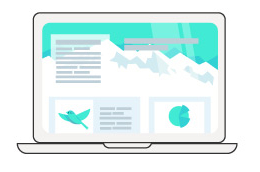
Good UX design scores points with an attractively designed user interface and convincing functionality that also does justice to the target group. If your customers feel comfortable on your site and find it easy to navigate, they are more likely to buy one of your products. How exactly you design your online store is of course up to you. However, we have put together a few ideas that can help you improve your conversion rate.
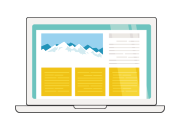
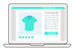
1. a clear structure of the online shop
In order for your customers to convert, i.e. complete a purchase, your website must be structured in such a way that they can navigate it intuitively. Keep your online store simple and avoid unnecessary extras. Ask yourself what would be important to you as a customer and leave out everything else. The fewer functions, texts and elements you include, the more the focus will be on the really important things.
2. simple and instinctive navigation
In fact, you don't have to reinvent the wheel for a good user experience and usability. Sometimes it is much more effective if the design and structure are not complicated. You should pay particular attention to this when it comes to navigation. It's important that your customers can find their way around intuitively. You shouldn't hide the menu behind an unusual icon. Instead, use an icon that can also be found in most other online stores. This way, your customers will know immediately where to find the menu. The menu should also be sorted accordingly so that your customer can reach their destination quickly. The faster they find what they are looking for, the more likely they are to convert. In general, remember that fewer clicks to the destination mean that your customer will complete the purchase faster and more likely.
3. help your customers find their way around better
You can also incorporate design elements into your online store that make it easier for your customers to find their way around. For example, good generic terms or meaningful images for the categories of the online store can help. A progress bar within the checkout process also helps your customers immensely. You should also keep it simple. Your customers don't want to spend a lot of time completing the purchase. So only ask for data that is actually needed. Anything else will annoy your customer and could prevent them from getting to the end of the checkout process.
4. a promising search function
Find instead of search: That should be the motto of the search function in your online store. You can make the search function easier to use by providing your own filters that your customer only needs to click on. Also make sure that every search leads to results. An unfulfilled search is frustrating, which is why you should avoid it. Customers who don't find what they're looking for straight away will end their visit to your online store much more quickly. Instead of continuing to browse your store, they will look for another one.
5. eye-catching CTA buttons
 If you want to draw attention to a specific aspect of your online store, it helps to use eye-catching CTA buttons. CTA stands for Call to Action and means the request to the customer to perform an action. For example, you can highlight the "Buy now" button in your online store with a colored background. Your potential customers will notice a colored button if the rest of the online store is rather neutral. Within the first few moments on a product detail page, your customer will have registered the CTA button. If they like the product, they are more likely to click on "Buy now" and complete the purchase. Let's assume that you have not included such a button. Then the customer would first place the product in the shopping cart. In very few cases will they then go straight to the shopping cart to complete the purchase, but perhaps browse a little further. But then a short distraction such as a phone call is enough and the shopping process is not completed.
6. optimization of the shopping cart
To get your customers to buy as quickly as possible, you also need to take a look at your shopping cart. There is probably potential for optimization there too. The shopping process should be intuitive, leave no questions unanswered and only require the most important data. You should also always inform your customers how much is currently in their shopping cart. You can easily do this with the help of a pop-up. This always appears when your customer adds a new product to the shopping cart and informs them of the current shopping cart value. After all, you don't want your customer to be surprised afterwards if their budget is exceeded. This can also lead to a purchase being abandoned.
7. fast loading times
 Don't you get impatient when a website takes a conspicuously long time to load completely? You may be able to tolerate this once, but if the page takes so long to load every time you click on it again, your patience will soon run out. In most cases, long loading times lead to users leaving the website, which is why you should definitely ensure fast loading times in your online store. Optimize images and graphics, for example, as they are often the reason for long loading times.
8. the choice of colors
Nowadays, the colors on most websites are limited to black, white, grey and individual accent colors. However, this is not a must in web design, as you can of course use more colors. However, you should keep in mind that colors attract attention. With many different colors, your online store could appear confusing. This could result in confusion and sensory overload for your customers. The colors in your online store should also be reflected on each individual subpage. This ensures a uniform image with recognition value!
9. different fonts
There are also no general rules when choosing a font. Typically, a maximum of one or two clear, sans serif fonts are used to optimize readability, especially for smaller scaled and longer texts. However, serif fonts are now also being used more often again, but usually only as headings or embellishments, as it becomes too tiring to read the text in the long term.
Further advantages of an optimized UX and usability design
 In addition to an increase in the conversion rate, an optimized UX and usability design also puts you in a better position to acquire new customers. If new visitors to your online store are not yet familiar with the products, the overall package must be convincing. Of course, this also contributes to an increase in the conversion rate. But there are also several other advantages that you can benefit from if you adapt your user experience. By increasing the visual quality, you build more trust with your customers. You also save costs. Because with the same number of visitors, you will now generate more revenue. And this in turn means that you need less money for marketing your online store. You no longer need as many visitors to increase sales, but instead convert the number of visitors you already receive into money. That sounds promising, doesn't it?
Conclusion
UX and usability design is all about putting the customer at the center. If you take our tips into account, your customer will feel more comfortable in your online store and find what they are looking for straight away. A smooth shopping experience is much more likely to result in a product sale. So always remember that your online store should be as simple as possible. Emphasize important elements, but avoid bells and whistles.
If you are now wondering how you can best implement this for you and your online store, we will be happy to help you. As a software and shopware agency, EXWE will help you with your relevant and successful UX design. We can improve and develop the existing design of your online store or set up an online store from scratch. We structure the web product visually and also take corporate identities into account. You don't have any professional image material yet? No problem, we'll take care of that too! Would you like to find out more about our UX design services? Then give us a call or take a look at our UX services overview.
Was ist dein Projekt? Wenn du uns darüber erzählen möchtest, rufen wir dich zurück!

Hello, my name is Meike. I take care of the EXWE back office and am responsible for our social media channels. All of our articles are meant to make your life easier and help you make decisions. Nevertheless, it can happen that something remains unclear, so: If you have questions about this article you can easily reach me at +49 231 93149827.
It should be urgently prevented to provide image names e.g. as my_advertisement.jpg or other abbreviations in this direction.
Are you interested in setting up an online store but don't know where to start? Here you will find tips & tricks for your own store
E-commerce solutions for your store - how to professionalize your merchandise management with the help of Pickware and JTL